How do you design an editorial identity for a publishing house that works for everything from operas and choral works to songs? This was the question when I began working on the design and cover for Egil Kolind’s publishing company, Krogager.
Egil has already made a mark on the church music scene in Denmark. He is one of the country’s youngest cathedral conductors, and on top of that, he is now publishing his own music.
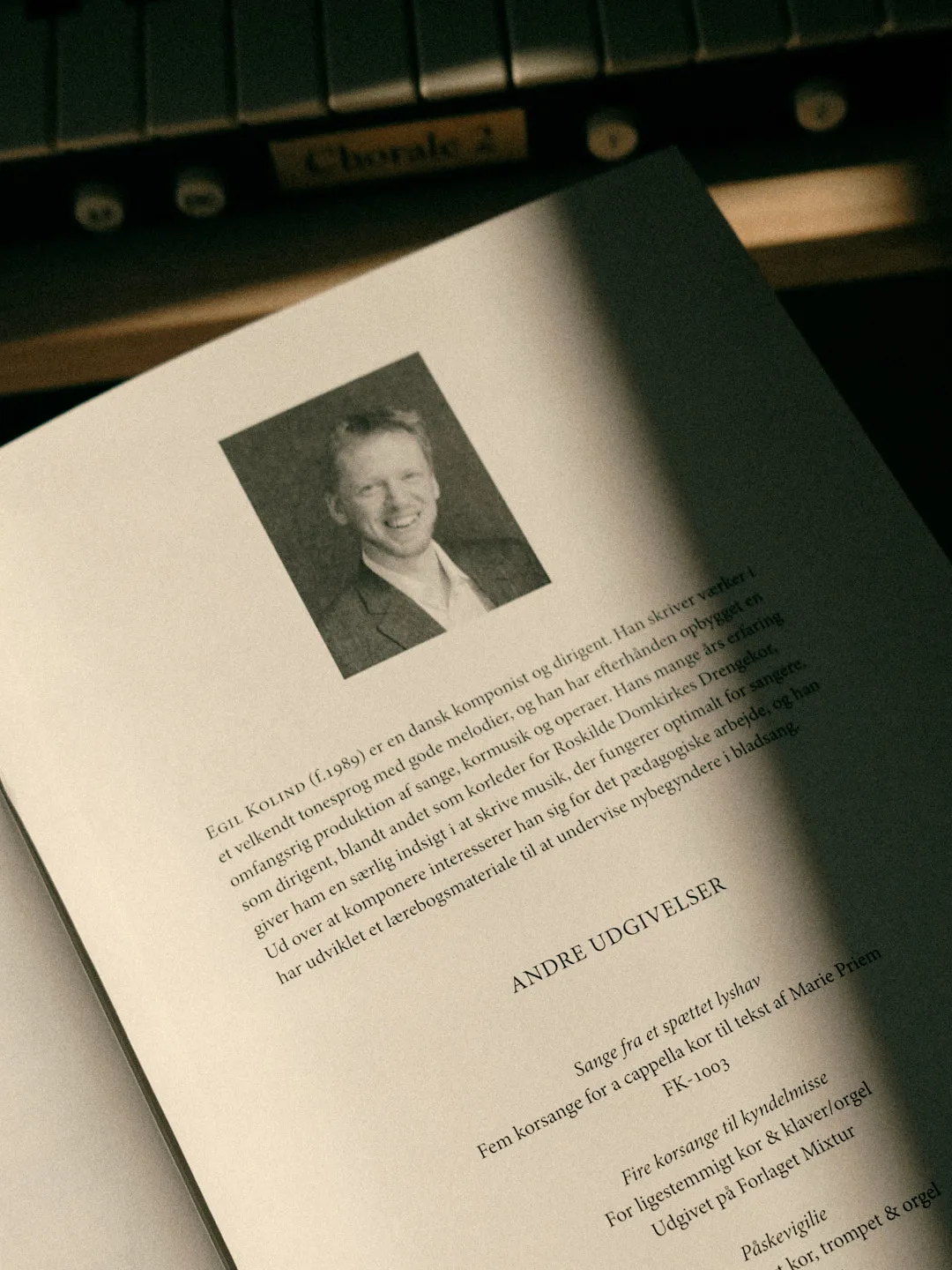
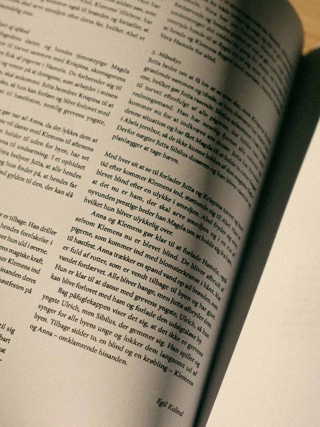
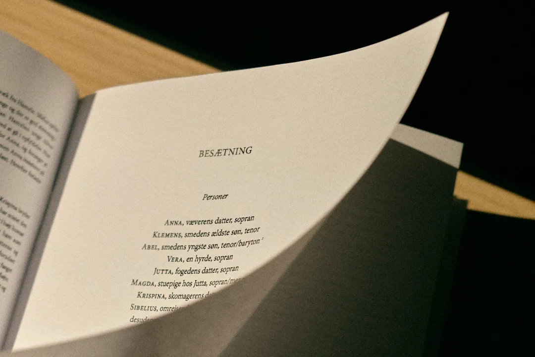
I started by looking at everything the pages needed to hold, like performance notes, librettos, and a composer biography. The solution was to build small modules that fit together, no matter what kind of music is being published. Egil can then put the blocks together to fit his needs.
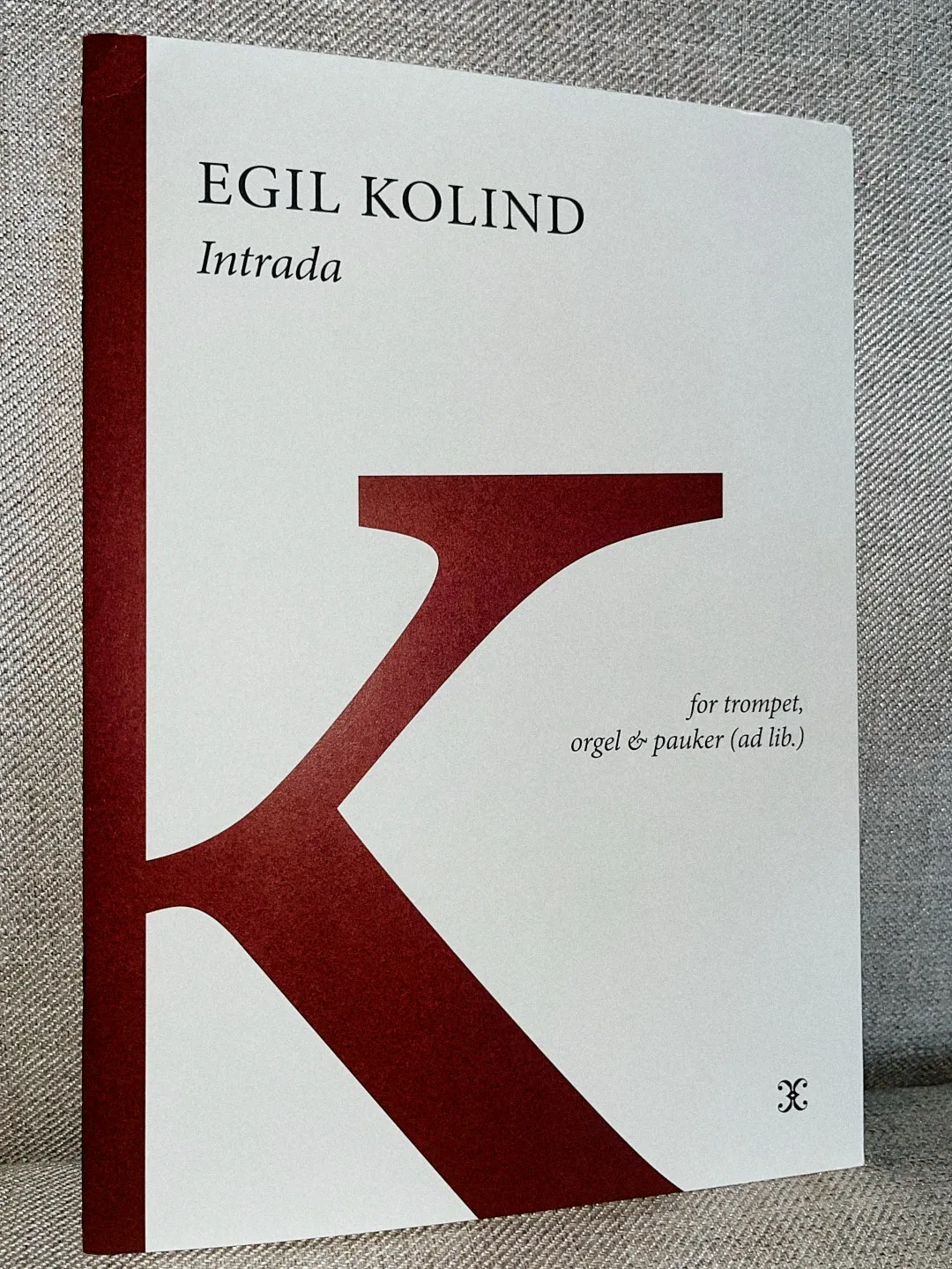
For the cover, I played around with a few different directions. It struck me that the letter ‘K’ is central to the identity. It represents Egil’s surname but also the publishing house itself, a coincidence too good to ignore. Placed on the front, the letter divides the page into two spaces, one for the title and one for the subtitle.
This editorial identity makes it easy to recognise every Krogager score. The colour of the ‘K’ shifts depending on the publication. It binds the whole collection together, while still letting each publication have its own character.